Vosges Chocolate Halloween set
The objective of this project is to design a Halloween gift set for Vosges Haut-Chocolate, a chocolatier based in Chicago.
Vosges Haut-Chocolat is a Chicago-based luxury chocolate maker, founded in 1998, that offers varieties flavored with spices, bacon, and other ingredients. It is owned by Katrina Markoff, who also created the Wild Ophelia brand to offer natural non-GMO Americana chocolates.

Development process
Tools: Procreate, Photoshop, Illustrator, Minc foiling, Epson p9000.
Challenges: Designing a chocolate packaging with a Halloween theme that still aligns with the brand.
Outcome: A beautifully designed tarot-deck-inspired chocolate packaging.
To celebrate the Halloween season, I have designed 4 different chocolate packaging for Vosges chocolate brand. Vosges Haut-Chocolat is a Chicago-based luxury chocolate maker, founded in 1998.
Ideation
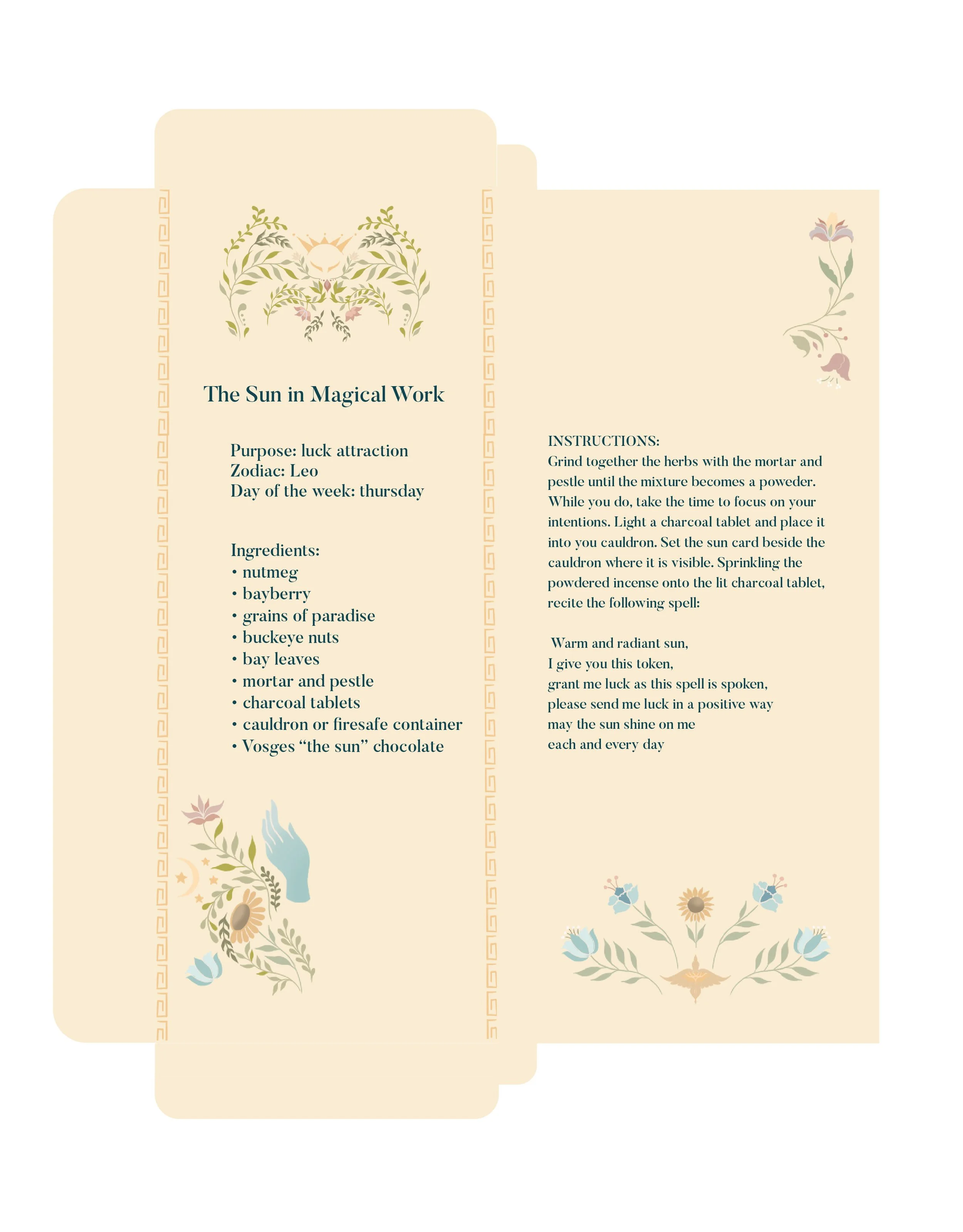
To keep up with the Halloween theme, I took inspiration from the tarot deck as the design direction for the chocolate packaging. There are 4 cards that I have implemented in the design:
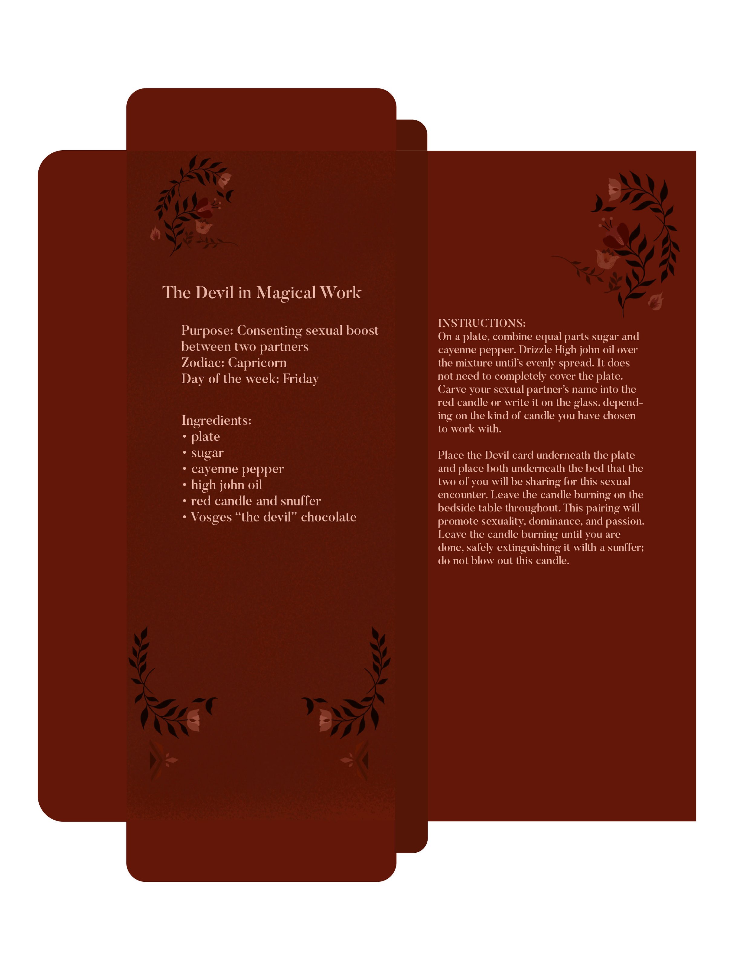
1. Devil
2. Death
3. Sun
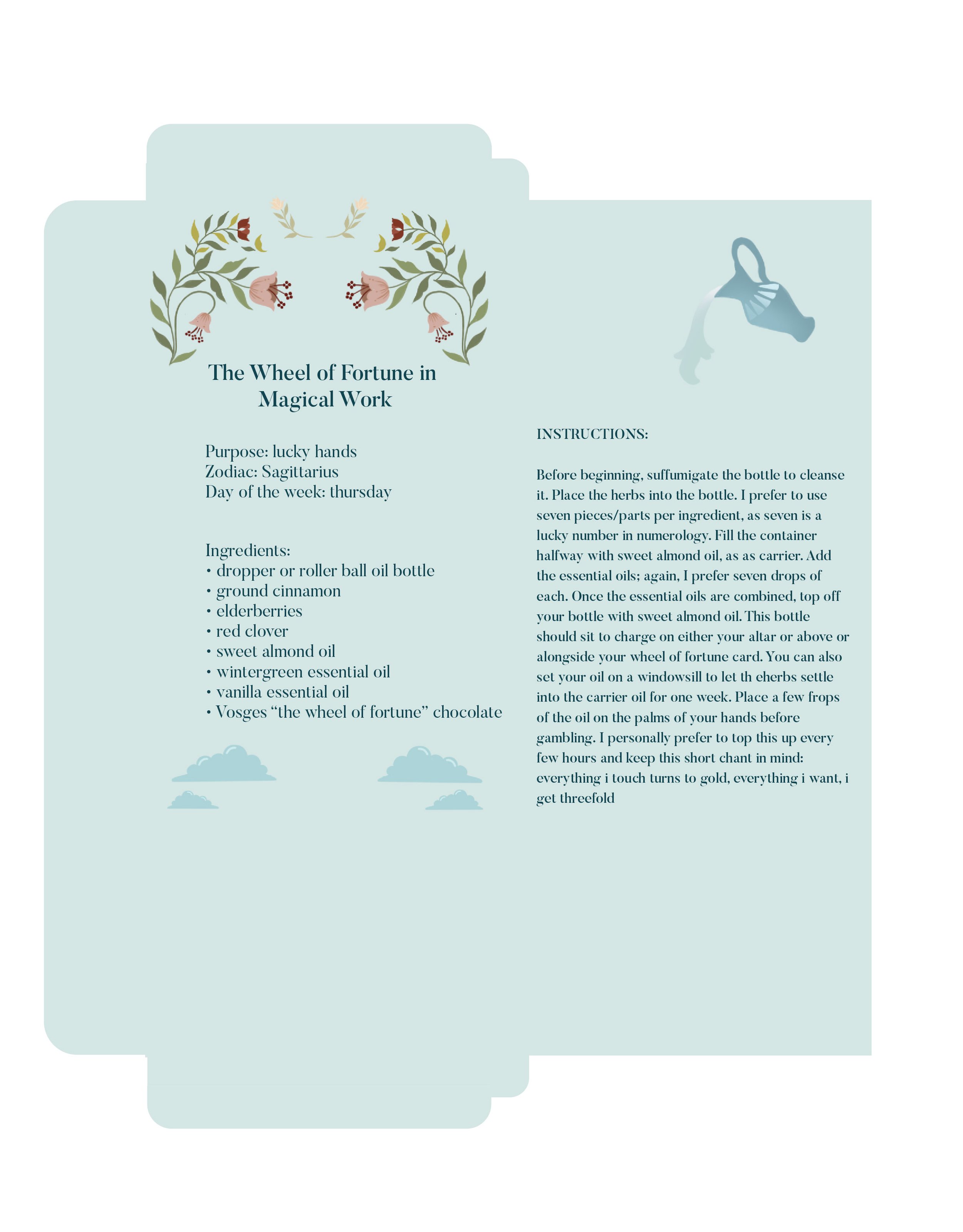
4. Wheel of Fortune
Even though Halloween is typically associated with occult and dark arts, I wanted to make sure that the customers have option to choose a more positive card.
Initial Design
These 3 projects were initially designed in summer 2019. At the time, the design has no focus or clear direction. Even though the idea was still the same, which is pulling the inspiration from the tarot deck, the execution lack finesse. The picture above is process illustrations. (I might have deleted the original since I hated it so much). There’s no typography treatment during this stage.
Moodboard
Inspiration & Source
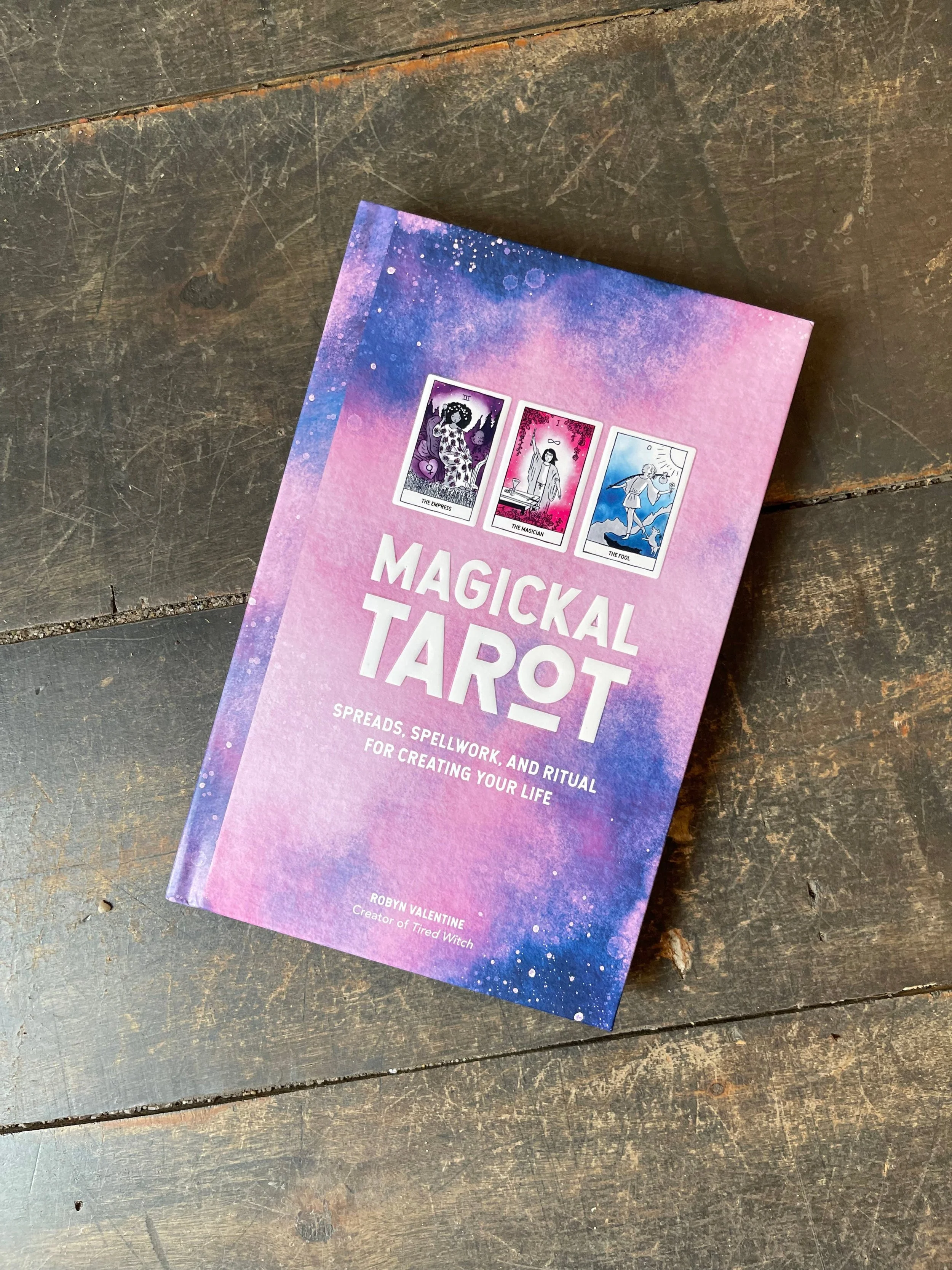
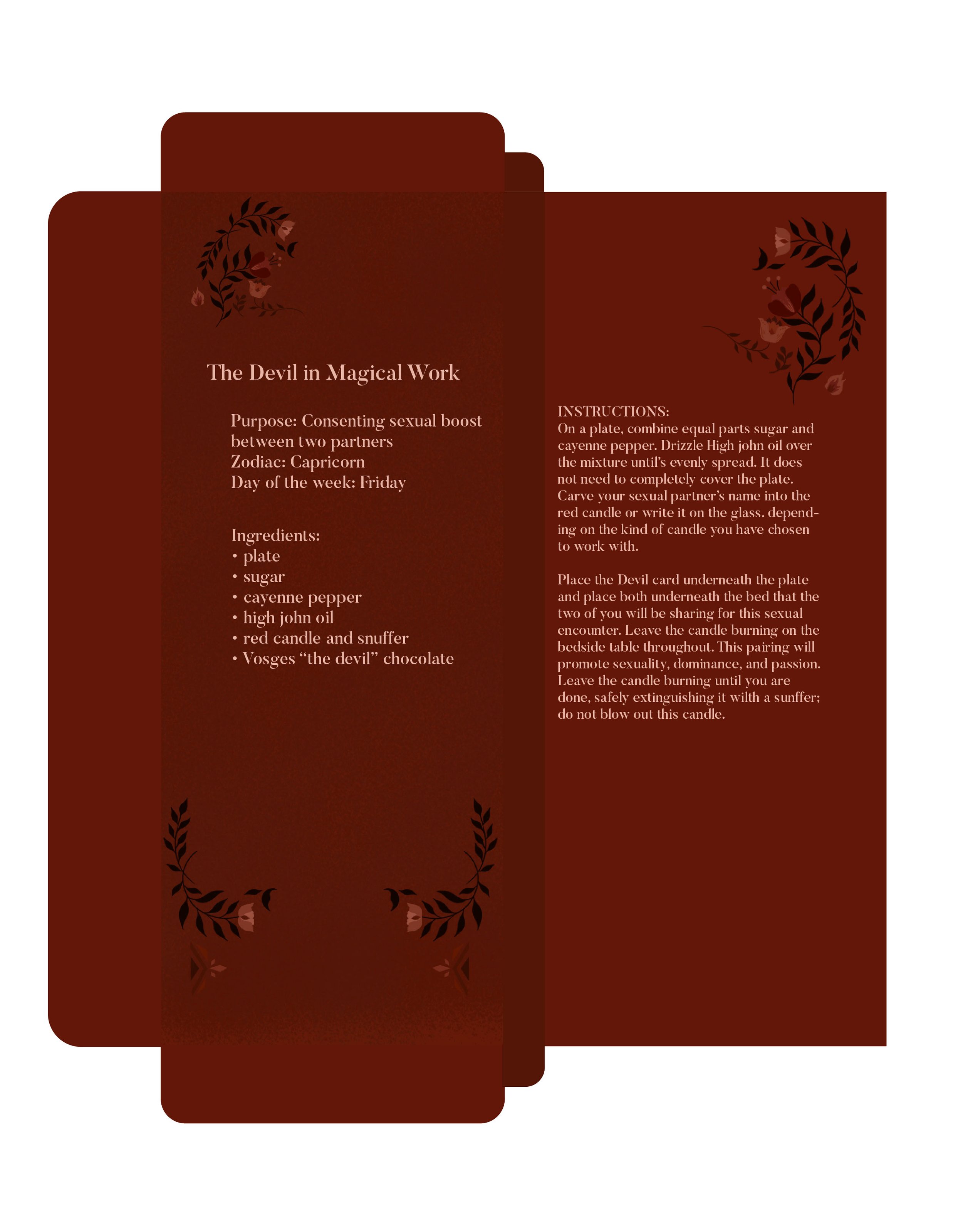
To keep the design as authentic as possible, I designed the inner part of the packaging with little tidbits from the book Magickal Tarot.
The hidden quotes and the styling of the packaging creates an immersive experience for the customer as they enjoy one of our chocolates.
Sketches
Inspiration
Anubis was the core inspiration for the Death illustration. I combined the different mythology from Japan, Egypt, and Greek to create a unique and intricate design.


Thought process ✏️
I love chocolate. I love tarot deck. I can draw. What else? 😝
Well, the ideas were the same from when the project was first developed.
Wheel of Fortune
Flavor: Banana Coconut
The wheel represent the wheel of life. In each corner of the card we see four winged creatures sitting upon clouds. These creatures represent the four elements of minor arcana.
Death
Flavor: Smoke & Stout
Death card typically implies an end, possibly of a relationship or interest, and therefore implies an increased sense of self-awareness. It’s rarely an indication of physical death.
The Sun
Flavor: Dulce de Leche
The Sun card represents success, abundance, and radiance. Like
the sun itself, it gives strength and vitality to all those that are lucky enough to feel its rays. That’s why the image of the Sun is the largest in this card.
The Devil
Flavor: Black Salt Caramel
Devil symbolized sexuality, narcicissm, and obsession that often depicted by the demon. The foxes on the design was inspired by the Japanese mythology, Kitsune that often preceived as an evil deity.




Reflection
This was a very cathartic experience. I am the kind of person who couldn’t tell stories without experience it with a literal sense. I don’t do bullcrap unless it’s necessary for the greater good. I love illustration & design equally. it took me so many years to finally understand how important it is to love yourself first before anyone else. Which I did for a moment during my “soul searching.”
This chocolate packaging is about the things I love, hate, sad, and any other emotions that I can’t name for now. But that’s okay, cause I know the one who matters would understand this.
It didn’t occur to me before but it all made sense now. I hope you enjoy this design as much as I did when I was working on it using the Wacom tablet from my favorite, Travis Hood ❤️
Sometimes it took a village for you to get to know yourself, or just that one person who believes in you. But at the end of the day, it’s all about you ;)
